Showing posts with label statistics. Show all posts

Thursday, July 19, 2012

Measuring Quality: Probably Not Easy


I am a bit delayed getting my latest post up.  I am writing up some thoughts on this recentstudy put out by ARCO, which suggests that the level of quality in clinical trials does not vary significantly across global regions.

The study has gotten some attention through ARCO’s press release (an interesting range of reactions: the PharmaTimes headline declares “Developingcountries up to scratch on trial data quality”, while Pharmalot’s headline, “WhatProblem With Emerging Markets Trial Data?”, betrays perhaps a touch more skepticism). 


And it’s a very worthwhile topic: much of the difficultly, unfortunately, revolves around agreeing on what we consider adequate metrics for data quality.  The study only really looks at one metric (query rates), but does an admirably job of trying to view that metric in a number of different ways.  (I wrote about another metric – protocol deviations – in a previous post on the relation of quality to site enrollment performance.)

I have run into some issues parsing the study results, however, and have a question in to the lead author.  I’ll withhold further comment until I head back and have had a chance to digest a bit more.

Sunday, July 15, 2012

Site Enrollment Performance: A Better View

Pretty much everyone involved in patient recruitment for clinical trials seems to agree that "metrics" are, in some general sense, really really important. The state of the industry, however, is a bit dismal, with very little evidence of effort to communicate data clearly and effectively. Today I’ll focus on the Site Enrollment histogram, a tried-but-not-very-true standby in every trial.

Consider this graphic, showing enrolled patients at each site. It came through on a weekly "Site Newsletter" for a trial I was working on:


I chose this histogram not because it’s particularly bad, but because it’s supremely typical. Don’t get me wrong ... it’s really bad, but the important thing here is that it looks pretty much exactly like every site enrollment histogram in every study I’ve ever worked on.

This is a wasted opportunity. Whether we look at per-site enrollment with internal teams to develop enrollment support plans, or share this data with our sites to inform and motivate them, a good chart is one of the best tools we have. To illustrate this, let’s look at a few examples of better ways to look at the data.

If you really must do a static site histogram, make it as clear and meaningful as possible. 

This chart improves on the standard histogram in a few important ways:


Stateful histo - click to enlarge

  1.  It looks better. This is not a minor point when part of our work is to engage sites and makes them feel like they are part of something important. Actually, this graph is made clearer and more appealing mostly by the removal of useless attributes (extraneous whitespace, background colors, and unhelpful labels).
  2. It adds patient disposition information. Many graphs – like the one at the beginning of this post – are vague about who is being counted. Does "enrolled" include patients currently being screened, or just those randomized? Interpretations will vary from reader to reader. Instead, this chart makes patient status an explicit variable, without adding to the complexity of the presentation. It also provides a bit of information about recent performance, by showing patients who have been consented but not yet fully screened.
  3. It ranks sites by their total contribution to the study, not by the letters in the investigator’s name. And that is one of the main reasons we like to share this information with our sites in the first place.
Find Opportunities for Alternate Visualizations
 
There are many other ways in which essentially the same data can be re-sliced or restructured to underscore particular trends or messages. Here are two that I look at frequently, and often find worth sharing.

Then versus Now

Tornado chart - click to enlarge

This tornado chart is an excellent way of showing site-level enrollment trajectory, with each sites prior (left) and subsequent (right) contributions separated out. This example spotlights activity over the past month, but for slower trials a larger timescale may be more appropriate. Also, how the data is sorted can be critical in the communication: this could have been ranked by total enrollment, but instead sorts first on most-recent screening, clearly showing who’s picked up, who’s dropped off, and who’s remained constant (both good and bad).

This is especially useful when looking at a major event (e.g., pre/post protocol amendment), or where enrollment is expected to have natural fluctuations (e.g., in seasonal conditions).

Net Patient Contribution

In many trials, site activation occurs in a more or less "rolling" fashion, with many sites not starting until later in the enrollment period. This makes simple enrollment histograms downright misleading, as they fail to differentiate sites by the length of time they’ve actually been able to enroll. Reporting enrollment rates (patients per site per month) is one straightforward way of compensating for this, but it has the unfortunate effect of showing extreme (and, most importantly, non-predictive), variance for sites that have not been enrolling for very long.

As a result, I prefer to measure each site in terms of its net contribution to enrollment, compared to what it was expected to do over the time it was open:
Net pt contribution - click to enlarge

To clarify this, consider an example: A study expects sites to screen 1 patient per month. Both Site A and Site B have failed to screen a single patient so far, but Site A has been active for 6 months, whereas Site B has only been active 1 month.

On an enrollment histogram, both sites would show up as tied at 0. However, Site A’s 0 is a lot more problematic – and predictive of future performance – than Site B’s 0. If I compare them to benchmark, then I show how many total screenings each site is below the study’s expectation: Site A is at -6, and Site B is only -1, a much clearer representation of current performance.

This graphic has the added advantage of showing how the study as a whole is doing. Comparing the total volume of positive to negative bars gives the viewer an immediate visceral sense of whether the study is above or below expectations.

The above are just 3 examples – there is a lot more that can be done with this data. What is most important is that we first stop and think about what we’re trying to communicate, and then design clear, informative, and attractive graphics to help us do that.

Tuesday, July 10, 2012

Why Study Anything When You Already Know Everything?

If you’re a human being, in possession of one working, standard-issue human brain (and, for the remainder of this post, I’m going to assume you are), it is inevitable that you will fall victim to a wide variety of cognitive biases and mistakes.  Many of these biases result in our feeling much more certain about our knowledge of the world than we have any rational grounds for: from the Availability Heuristic, to the Dunning-Kruger Effect, to Confirmation Bias, there is an increasingly-well-documented system of ways in which we (and yes, that even includes you) become overconfident in our own judgment.

Over the years, scientists have developed a number of tools to help us overcome these biases in order to better understand the world.  In the biological sciences, one of our best tools is the randomized controlled trial (RCT).  In fact, randomization helps minimize biases so well that randomized trials have been suggested as a means of developing better governmental policy.

However, RCTs in general require an investment of time and money, and they need to be somewhat narrowly tailored.  As a result, they frequently become the target of people impatient with the process – especially those who perhaps feel themselves exempt from some of the above biases.

A shining example of this impatience-fortified-by-hubris can be
4 out of 5 Hammer Doctors agree:
the world is 98% nail.
found in a recent “Speaking of Medicine” blog post by Dr Trish Greenhalgh, with the mildly chilling title Less Research is Needed.  In it, the author finds a long list of things she feels to be so obvious that additional studies into them would be frivolous.  Among the things the author knows, beyond a doubt, is that patient education does not work, and electronic medical records are inefficient and unhelpful. 

I admit to being slightly in awe of Dr Greenhalgh’s omniscience in these matters. 

In addition to her “we already know the answer to this” argument, she also mixes in a completely different argument, which is more along the lines of “we’ll never know the answer to this”.  Of course, the upshot of that is identical: why bother conducting studies?  For this argument, she cites the example of coronary artery disease: since a large genomic study found only a small association with CAD heritability, Dr Greenhalgh tells us that any studies of different predictive methods is bound to fail and thus not worth the effort (she specifically mentions “genetic, epigenetic, transcriptomic, proteomic, metabolic and intermediate outcome variables” as things she apparently already knows will not add anything to our understanding of CAD). 

As studies grow more global, and as we adapt to massive increases in computer storage and processing ability, I believe we will see an increase in this type of backlash.  And while physicians can generally be relied on to be at the forefront of the demand for more, not less, evidence, it is quite possible that a vocal minority of physicians will adopt this kind of strongly anti-research stance.  Dr Greenhalgh suggests that she is on the side of “thinking” when she opposes studies, but it is difficult to see this as anything more than an attempt to shut down critical inquiry in favor of deference to experts who are presumed to be fully-informed and bias-free. 

It is worthwhile for those of us engaged in trying to understand the world to be aware of these kinds of threats, and to take them seriously.  Dr Greenhalgh writes glowingly of a 10-year moratorium on research – presumably, we will all simply rely on her expertise to answer our important clinical questions.

Friday, July 6, 2012

A placebo control is not a placebo effect

Following up on yesterday's post regarding a study of placebo-related information, it seems worthwhile to pause and expand on the difference between placebo controls and placebo effects.

The very first sentence of the study paper reflects a common, and rather muddled, belief about placebo-controlled trials:
Placebo groups are used in trials to control for placebo effects, i.e. those changes in a person's health status that result from the meaning and hope the person attributes to a procedure or event in a health care setting.
The best I can say about the above sentence is that in some (not all) trials, this accounts for some (not all) of the rationale for including a placebo group in the study design. 

There is no evidence that “meaning and hope” have any impact on HbA1C levels in patients with diabetes. The placebo effect only goes so far, and certainly doesn’t have much sway over most lab tests.  And yet we still conduct placebo-controlled trials in diabetes, and rightly so. 

To clarify, it may be helpful to break this into two parts:
  1. Most trials need a “No Treatment” arm. 
  2. Most “No Treatment” arms should be double-blind, which requires use of a placebo.
Let’s take these in order.

We need a “No Treatment” arm:
  • Where the natural progression of the disease is variable (e.g., many psychological disorders, such as depression, have ups and downs that are unrelated to treatment).  This is important if we want to measure the proportion of responders – for example, what percentage of diabetes patients got their HbA1C levels below 6.5% on a particular regimen.  We know that some patients will hit that target even without additional intervention, but we won’t know how many unless we include a control group.
  • Where the disease is self-limiting.  Given time, many conditions – the flu, allergies, etc. – tend to go away on their own.  Therefore, even an ineffective medication will look like it’s doing something if we simply test it on its own.  We need a control group to measure whether the investigational medication is actually speeding up the time to cure.
  • When we are testing the combination of an investigational medication with one or more existing therapies. We have a general sense of how well metformin will work in T2D patients, but the effect will vary from trial to trial.  So if I want to see how well my experimental therapy works when added to metformin, I’ll need a metformin-plus-placebo control arm to be able to measure the additional benefit, if any.

All of the above are especially important when the trial is selecting a group of patients with greater disease severity than average.  The process of “enriching” a trial by excluding patients with mild disease has the benefit of requiring many fewer enrolled patients to demonstrate a clinical effect.  However, it also will have a stronger tendency to exhibit “regression to the mean” for a number of patients, who will exhibit a greater than average improvement during the course of the trial.  A control group accurately measures this regression and helps us measure the true effect size.

So, why include a placebo?  Why not just have a control group of patients receiving no additional treatment?  There are compelling reasons:
  • To minimize bias in investigator assessments.  We most often think about placebo arms in relation to patient expectations, but often they are even more valuable in improving the accuracy of physician assessments.  Like all humans, physician investigators interpret evidence in light of their beliefs, and there is substantial evidence that unblinded assessments exaggerate treatment effects – we need the placebo to help maintain investigator blinding.
  • To improve patient compliance in the control arm.  If a patient is clearly not receiving an active treatment, it is often very difficult to keep him or her interested and engaged with the trial, especially if the trial requires frequent clinic visits and non-standard procedures (such as blood draws).  Retention in no-treatment trials can be much lower than in placebo-controlled trials, and if it drops low enough, the validity of any results can be thrown into question.
  • To accurately gauge adverse events.  Any problem(s) encountered are much more likely to be taken seriously – by both the patient and the investigator – if there is genuine uncertainty about whether the patient is on active treatment.  This leads to much more accurate and reliable reporting of adverse events.
In other words, even if the placebo effect didn’t exist, it would still be necessary and proper to conduct placebo-controlled trials.  The failure to separate “placebo control” from “placebo effect” yields some very muddled thinking (which was the ultimate point of my post yesterday).

Thursday, July 5, 2012

The Placebo Effect (No Placebo Necessary)

4 out of 5 non-doctors recommend starting
with "regular strength", and titrating up from there...
(Photo from inventedbyamother.com)
The modern clinical trial’s Informed Consent Form (ICF) is a daunting document.  It is packed with a mind-numbing litany of procedures, potential risks, possible adverse events, and substantial additional information – in general, if someone, somewhere, might find a fact relevant, then it gets into the form.  A run-of-the-mill ICF in a phase 2 or 3 pharma trial can easily run over 10 pages of densely worded text.  You might argue (and in fact, a number of people have, persuasively) that this sort of information overload reduces, rather than enhances, patient understanding of clinical trials.

So it is a bit of a surprise to read a paper arguing that patient information needs to be expanded because it does not contain enough information.  And it is yet even more surprising to read about what’s allegedly missing: more information about the potential effects of placebo.

Actually, “surprising” doesn’t really begin to cover it.  Reading through the paper is a borderline surreal experience.  The authors’ conclusions from “quantitative analysis”* of 45 Patient Information Leaflets for UK trials include such findings as
  • The investigational medication is mentioned more often than the placebo
  • The written purpose of the trial “rarely referred to the placebo”
  • “The possibility of continuing on the placebo treatment after the trial was never raised explicitly”
(You may need to give that last one a minute to sink in.)

Rather than seeing these as rather obvious conclusions, the authors recast them as ethical problems to be overcome.  From the article:
Information leaflets provide participants with a permanent written record about a clinical trial and its procedures and thus make an important contribution to the process of informing participants about placebos.
And from the PR materials furnished along with publication:
We believe the health changes associated with placebos should be better represented in the literature given to patients before they take part in a clinical trial.
There are two points that I think are important here – points that are sometimes missed, and very often badly blurred, even within the research community:

1.    The placebo effect is not caused by placebos.  There is nothing special about a “placebo” treatment that induces a unique effect.  The placebo effect can be induced by a lot of things, including active medications.  When we start talking about placebos as causal agents, we are engaging in fuzzy reasoning – placebo effects will not only be seen in the placebo arm, but will be evenly distributed among all trial participants.

2.    Changes in the placebo arm cannot be assumed to be caused by the placebo effect.  There are many reasons why we may observe health changes within a placebo group, and most of them have nothing to do with the “psychological and neurological mechanisms” of the placebo effect.  Giving trial participant information about the placebo effect may in fact be providing them with an entirely inaccurate description of what is going on.

ResearchBlogging.org Bishop FL, Adams AEM, Kaptchuk TJ, Lewith GT (2012). Informed Consent and Placebo Effects: A Content Analysis of Information Leaflets to Identify What Clinical Trial Participants Are Told about Placebos. PLoS ONE DOI: 10.1371/journal.pone.0039661  


(* Not related to the point at hand, but I would applaud efforts to establish some lower boundaries to what we are permitted to call "quantitative analysis".  Putting counts from 45 brochures into an Excel spreadsheet should fall well below any reasonable threshold.)

Wednesday, June 20, 2012

Faster Trials are Better Trials

[Note: this post is an excerpt from a longer presentation I made at the DIA Clinical Data Quality Summit, April 24, 2012, entitled Delight the Sites: The Effect of Site/Sponsor Relationships on Site Performance.]

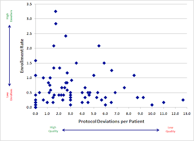
When considering clinical data collected from sites, what is the relationship between these two factors?
  • Quantity: the number of patients enrolled by the site
  • Quality: the rate of data issues per enrolled patient
When I pose this question to study managers and CRAs, I usually hear that they believe there is an inverse relationship at work. Specifically, most will tell me that high-enrolling sites run a great risk of getting "sloppy" with their data, and that they will sometimes need to caution sites to slow down in order to better focus on accurate data collection and reporting.

Obviously, this has serious implications for those of us in the business of accelerating clinical trials. If getting studies done faster comes at the expense of clinical data quality, then the value of the entire enterprise is called into question. As regulatory authorities take an increasingly skeptical attitude towards missing, inconsistent, and inaccurate data, we must strive to make data collection better, and absolutely cannot afford to risk making it worse.

As a result, we've started to look closely at a variety of data quality metrics to understand how they relate to the pace of patient recruitment. The results, while still preliminary, are encouraging.

Here is a plot of a large, recently-completed trial. Each point represents an individual research site, mapped by both speed (enrollment rate) and quality (protocol deviations). If faster enrolling caused data quality problems, we would expect to see a cluster of sites in the upper right quadrant (lots of patients, lots of deviations).

Click to enlarge: Enrollment and Quality


Instead, we see almost the opposite. Our sites with the fastest accrual produced, in general, higher quality data. Slow sites had a large variance, with not much relation to quality: some did well, but some of the worst offenders were among the slowest enrollers.

There are probably a number of reasons for this trend. I believe the two major factors at work here are:
  1. Focus. Having more patients in a particular study gives sites a powerful incentive to focus more time and effort into the conduct of that study.
  2. Practice. We get better at most things through practice and repetition. Enrolling more patients may help our site staff develop a much greater mastery of the study protocol.
The bottom line is very promising: accelerating your trial’s enrollment may have the added benefit of improving the overall quality of your data.

We will continue to explore the relationship between enrollment and various quality metrics, and I hope to be able to share more soon.

Monday, April 4, 2011

Nice WSJ article on p-values

The Wall Street Journal has a brief but useful lay overview of the concept of statistical significance. Without mentioning them by name, it provides accurate synopses of some of the least understood aspects of clinical trial data (the related-but-quite-different concept of clinical significance and the problem of multiplicity). Although ostensibly about the US Supreme Court's refusal to accept statistical significance as a standard for public disclosure of adverse event reports in its recent Matrixx ruling, the article has broad applicability, and I'm always happy to see these concepts clearly articulated.